A couple of months ago, I set up a democracy ranking website using the Allourideas software as part of a class project to crowdsource a democracy index (which has now been completed; more on that project in an upcoming post). The site works by presenting the user with a random comparison between two countries, and asking them to vote on which of these countries was more democratic in 2010 (click here if you can't see the widget below):
The 100 or so students in my class started the ball rolling, and their responses generated an initial democracy index that had a correlation of about 0.62 with the Freedom in the World index produced by Freedom House: respectable but not great. The post describing the initial results got some links from Mark Belinsky, the Allourideas blog, and Jonathan Bernstein, which increased the number of votes substantially. In fact, as of this writing, the website has registered 4402 (valid) votes, from about 203 different IP addresses, mostly in the USA, New Zealand, and Australia:

4,402 valid votes means at most 4,402 distinct comparisons out of a possible 36,672 potential comparisons of 192 countries (most comparisons have appeared only once, but a few have appeared a couple of times), or about 12% of all possible comparisons. How has the increase in the number of voters changed the generated index? And how does it compare to the current Freedom House index for 2010? As we shall see, the extra votes appear to have improved the crowdsourced index considerably.
Here is a map of the scores generated by the "crowd" - i.e., voters in the exercise (darker is more democratic, all data here):
And here's a scatterplot comparing the generated scores to Freedom House's scores for 2010 (click here for a proper large interactive version):
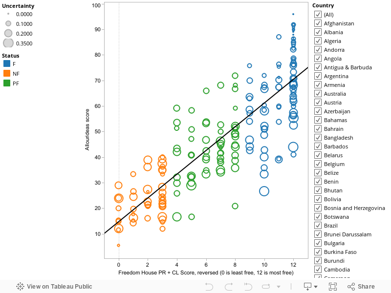
The Y axis represents the score generated by the Allourideas software: basically, the probability that the country would prevail in a comparison with a randomly selected country. For example, the Allourideas software predicts that Denmark (the highest ranked country) has a 96% chance, given previous votes, of prevailing in a “more democratic” comparison with another randomly selected country for 2010, whereas North Korea (the lowest ranked country) only has a 5% chance of prevailing in this comparison. The X axis represents the sum of the Freedom House Political Rights and Civil Liberties scores for last year (from the “Freedom in the World 2011” report), reversed and shifted so that 0 is least democratic and 12 is most democratic (i.e., 14-PR+CL). The correlation between Freedom House and the crowdsourced index is a fairly high 0.84 (which is about as high as the correlation between the combined Freedom House score and the Polity2 score for 2008: 0.87). But how good is this, really? What do these scores really represent?
At the extremes, judgments of democracy appear to be “easy”: Freedom House and the crowd converge. For example, among countries that Freedom House classifies as “Free,” only six countries (Benin, Israel, Mongolia, Sao Tome and Principe, and Suriname) receive a score of 40 or below from the “crowd,” which is the highest score that any country Freedom House classifies as “Not Free” receives (Russia). But in the middle there is a fair amount of overlap (just as with expert-coded indexes, whose high levels of correlation are driven by the “extreme” cases – clear democracies or clear dictatorships). Some of these disagreements could further be attributed to the relative obscurity of some of the countries involved, given the location of the voters in this exercise (few people know much about Benin, and anyway the index got no votes from Africa), but some of the disagreements seem to have more to do with the average conceptual model used by the crowd (e.g., the case of Israel). The crowd would seem to weigh the treatment of Palestinians more heavily than Freedom House in its (implicit) judgment of Israel’s democracy. This is unsurprising, since the website does not ask participants to stick to a particular “model” of democracy; the average model or concept of democracy to which the crowd appears to be converging seems to be slightly different than the model used by Freedom House.
We can try to figure out where the crowd differs the most from Freedom House by running a simple regression of Freedom House’s score on the score produced by the crowd, and looking at the residuals from the model as a measure of “lack of fit.” This extremely simple model can account for about 69% of the variance in the crowdsourced scores on the basis of the Freedom House score (all data available here); we can improve the fit (to 72%) by adding a measure of “uncertainy” as a control (the number of times a country appeared in an “I don’t know” event, divided by the total number of times it appeared in any comparison). What (I think) we’re doing here is basically trying to predict Freedom House’s index on the basis of the crowdsourced judgment plus a measure of the subjective uncertainty of the participants. The results are of some interest: for example, participants in the exercise appear to think Venezuela, Honduras, and Papua New Guinea have higher levels of democracy than Freedom House thinks, and they also appear to think that Sierra Leone, Lithuania, Israel, Mongolia, Kuwait, Kiribati, Benin, and Mauritius have lower levels of democracy than Freedom House thinks.
A more interesting test, however, would be to do what Pemstein, Meserve, and Melton do here with existing measures of democracy. Their work takes existing indexes of democracy as (noisy) measurements of the true level of democracy and attempts to estimate their error bounds by aggregating their information in a specific way. I might try do this later (I need to learn to use their software, and might only have time in a few weeks), though it is worth noting that a simple correlation of the crowdsourced score for 2010 with the “Unified Democracy Scores” Pemstein et. al. produce for 2008 by aggregating the information from all available indexes is an amazing 0.87, and a simple regression of one on the other has an R2 of .76. So the crowdsourced index seems to be doing something much like what the Unified Democracy Scores are doing: averaging different models of democracy and different "perspectives" on each country.
This all assumes, however, that there is something to be measured – a true level of democracy, which is only loosely captured by existing models. On this view, existing indexes of democracy reflect different interpretations of the concept of democracy, plus some noise due to imperfect information and the vagaries of judgment; they each involve a “fixed” bias due to potential misinterpretation of the concept, plus the uncertainty involved in trying to apply the concept to a messy reality whose features are not always easy to discern (try figuring out the level of civil rights violations in the Central African Republic compared with Peru in 2010, quick!). The crowdsourced index actually goes further and averages the different interpretations of democracy of every participant, just as the Unified Democracy Scores aggregate the different “models” of democracy used by different existing indexes. To the extent that the crowd’s models converge to the true model of democracy, then the crowdsourced index should also eliminate that “bias” due to misinterpretation. But it is not clear that there is a true model, or that the crowd will converge to it even if it existed: the crowdsourced index may have a higher bias (total amount of misinterpretation of the concept) than the indexes created by professional organizations. (And this conceptual bias might shift if more people from other countries voted; I’d really love to get more votes from Africa and Asia).
Even if there is no true model of democracy, it would be interesting to “reverse-engineer” the crowd’s implicit model by trying to figure out its components. (What do people weigh most, when thinking about democracy? Violations of civil liberties? Elections? Opportunities for participation? Economic opportunities?). One could do this, I suppose, by trying to predict the crowdsourced scores from linear combinations of independently gathered measures of elections, civil liberties, etc.; some form of factor analysis might help here? My feeling is that the crowd weighs economic “outcomes” more than experts do (so that crowdsourced assessments of democracy will be correlated with perceptions of how well a country is doing, like GDP growth), but I haven’t tried to investigate that possibility.
It would also be interesting to repeat the exercise by asking people to stick to a particular model of democracy (e.g., Freedom House’s checklist, or the checklist developed by my students – more on that later). It would also be great if the allourideas software had an option that allowed a voter to indicate that two countries are equal in their level of democracy (I think one could do this, but then I would have to modify the client; right now, the only way of signalling this is to click on the “I don’t know” button). Perhaps next year I will try some of these possibilities. All in all, it seems that crowdsourcing a democracy index produces reasonable results, and might produce even better results if the crowdsourcing is done with slightly more controls. (E.g., one could imagine using Amazon's "Mechanical Turk" and a specific model of democracy for generating data on particular years). I would nevertheless be interested in thoughts/further analysis from my more statistically sophisticated readers.
In an upcoming post I will explain how my students produced an index of democracy for 2010, 1995, and 1980, and how that crowdsourced effort compares with other existing indexes. (Short version: pretty well).
[Update 8:40pm: Made some minor changes in wording, added a couple of links]